Role Product Designer
Team 1 Product Manager, 1 Designer, 3 Content, 5 Engineers, 1 Data Scientist, 1 Marketing
Timeline Aug - Nov 2022
Team 1 Product Manager, 1 Designer, 3 Content, 5 Engineers, 1 Data Scientist, 1 Marketing
Timeline Aug - Nov 2022
CONTEXT
SmartNews
SmartNews is an award-winning news aggregator app with 50+ million readers in 150+ countries. Company algorithms analyze millions of articles daily to pop users’ filter bubbles and deliver the world’s top 0.01% of quality information to the people who need it.

MY WORK
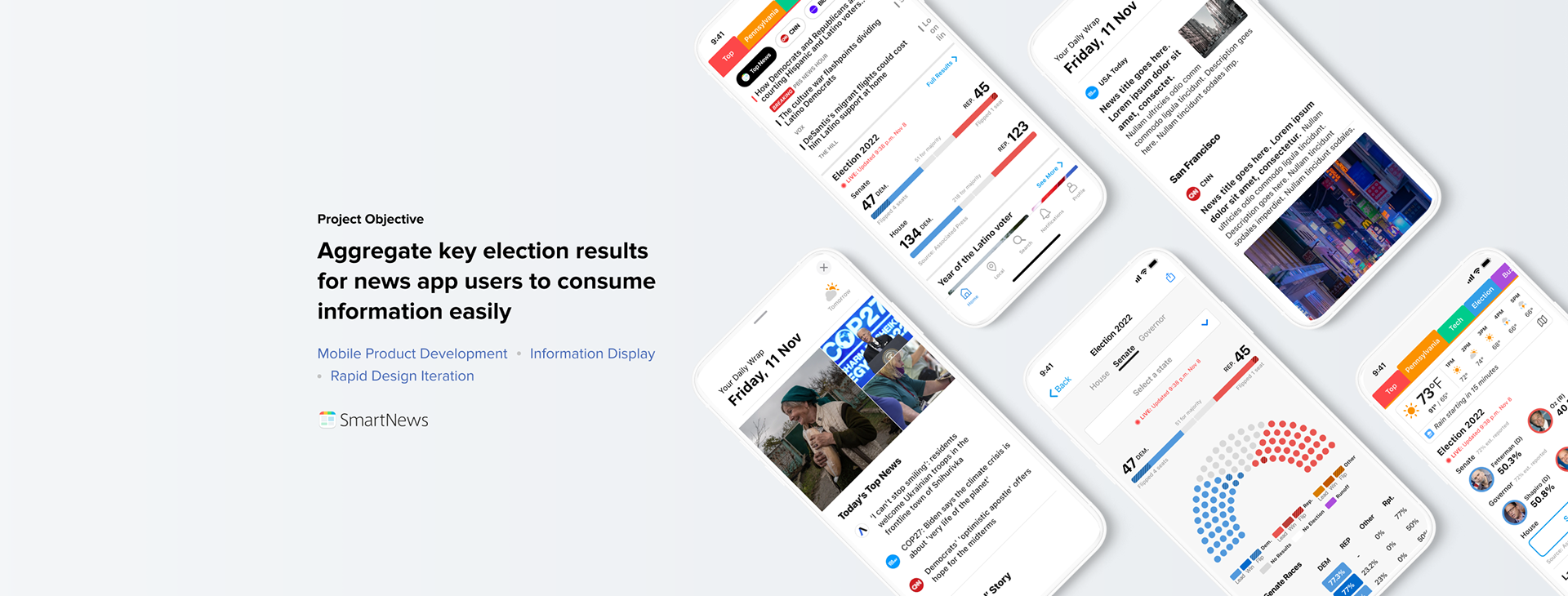
Designed 2022 Election Hub
that exceeded 3x of our goal metrics.
PROJECT OVERVIEW
Midterm Election 2022
The U.S. midterm elections were held on November 8, 2022. This project delivered election results and article highlights for SmartNews readers on the day of the election for the House, Senate, and Governor races.
Goals
This project is aimed to benefit the common good. For this reason, we chose user engagement metrics as the project targets and KPIs. We set metrics on widget CTRs, page views, and time spent.
DESIGN PROCESS
The team has a very tight timeline to deliver and launch Election 2022 project. In less than 3 months, we went from design, develop & testing, to launch.
Below is the design timeline:
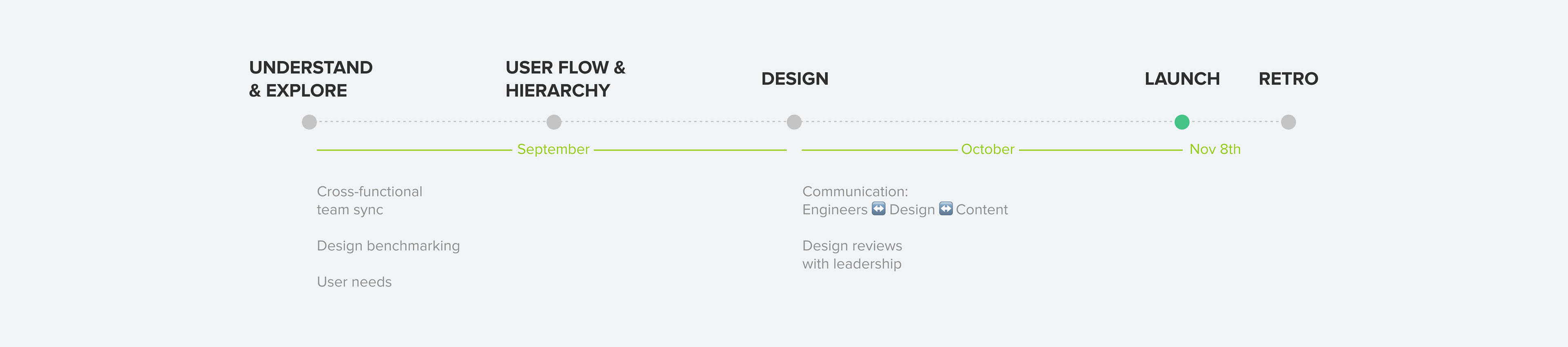
DEFINE
How might we prioritize the data and display them without overwhelming users?
In the "understanding & explore" stage, I benchmarked 7 news apps including SmartNews 2020 Election designs. Through these screens, I had a high-level concept of the data to display and collect the elements that need to be created.
Set up Design Goals
1. Gives users local information that is most relevant to them
2. Gives users progressive disclosure of information: introducing high-level summaries on widgets, then empowering users to dive deep into detailed data in the landing pages by providing easy navigation
DESIGN
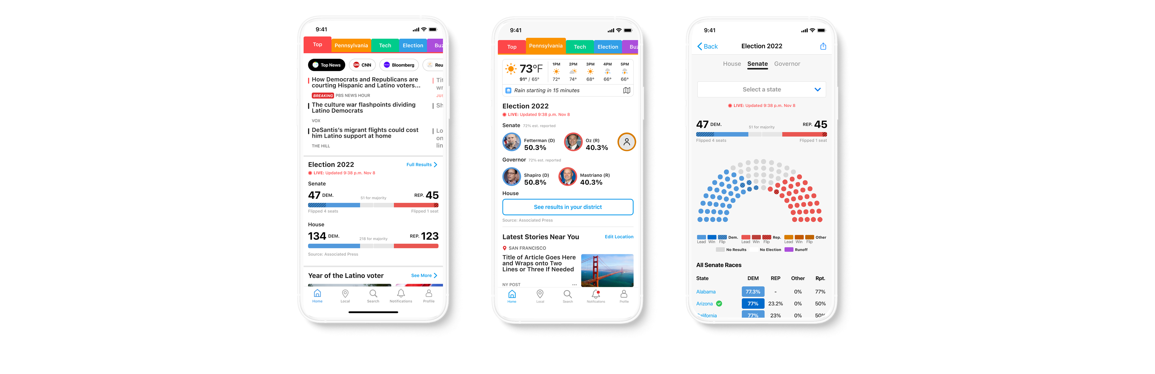
I created low-fidelity mocks with PM to clarify information architecture. Moreover, I reduced the layer of hierarchy to optimize navigation and make sure users get detailed election information with one tap.
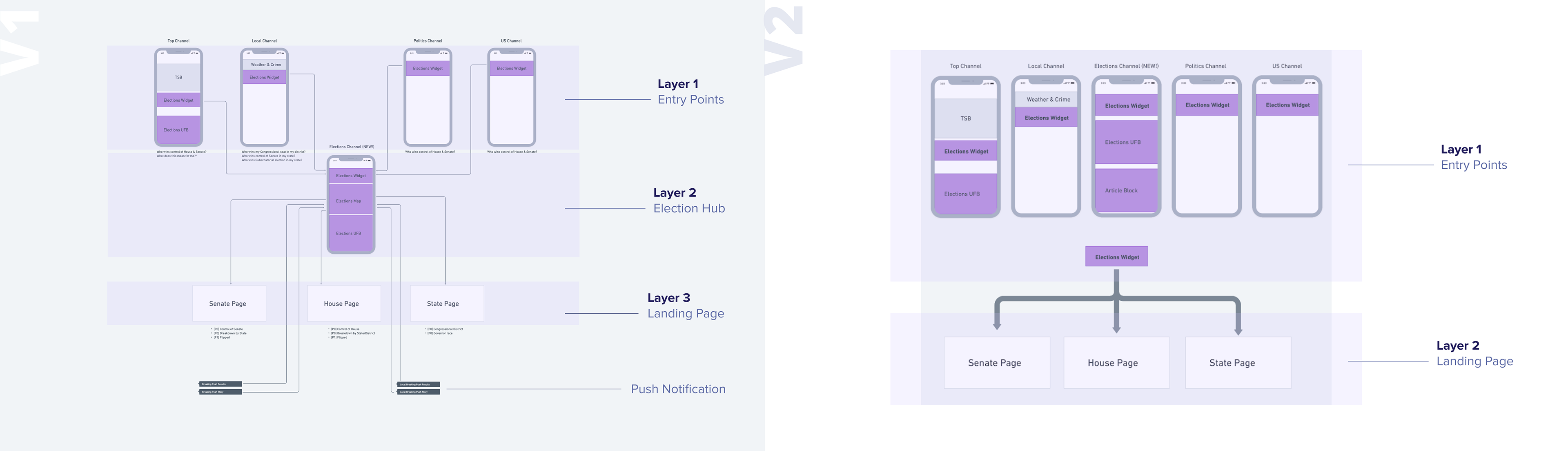
Define key elements
By mocking up mid-fidelity widgets and screens, I can clearly discuss the elements with cross-functional teams and ideate a better version. With a few ideations, I combined the ideas into these elements:
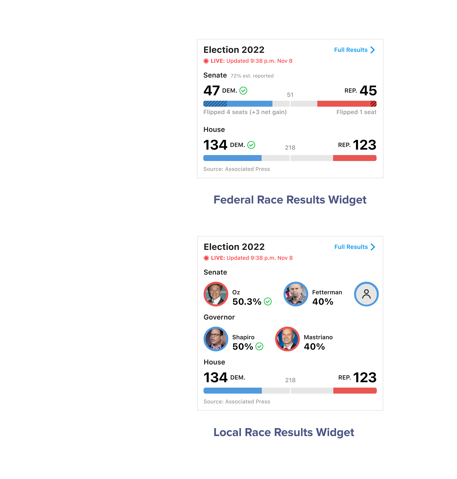
Federal Widget
• Highlights summary of the balance of power across Senate & House
• Pinned to Home page and Election channel
• Easy access to dive deeper into races happening across the country
• Pinned to Home page and Election channel
• Easy access to dive deeper into races happening across the country
Local Widget
• Highlights Senate and Governor races within the state.
• Easy access to the district landing page to give readers the ability to see who is leading the race in their district
• Easy access to the district landing page to give readers the ability to see who is leading the race in their district
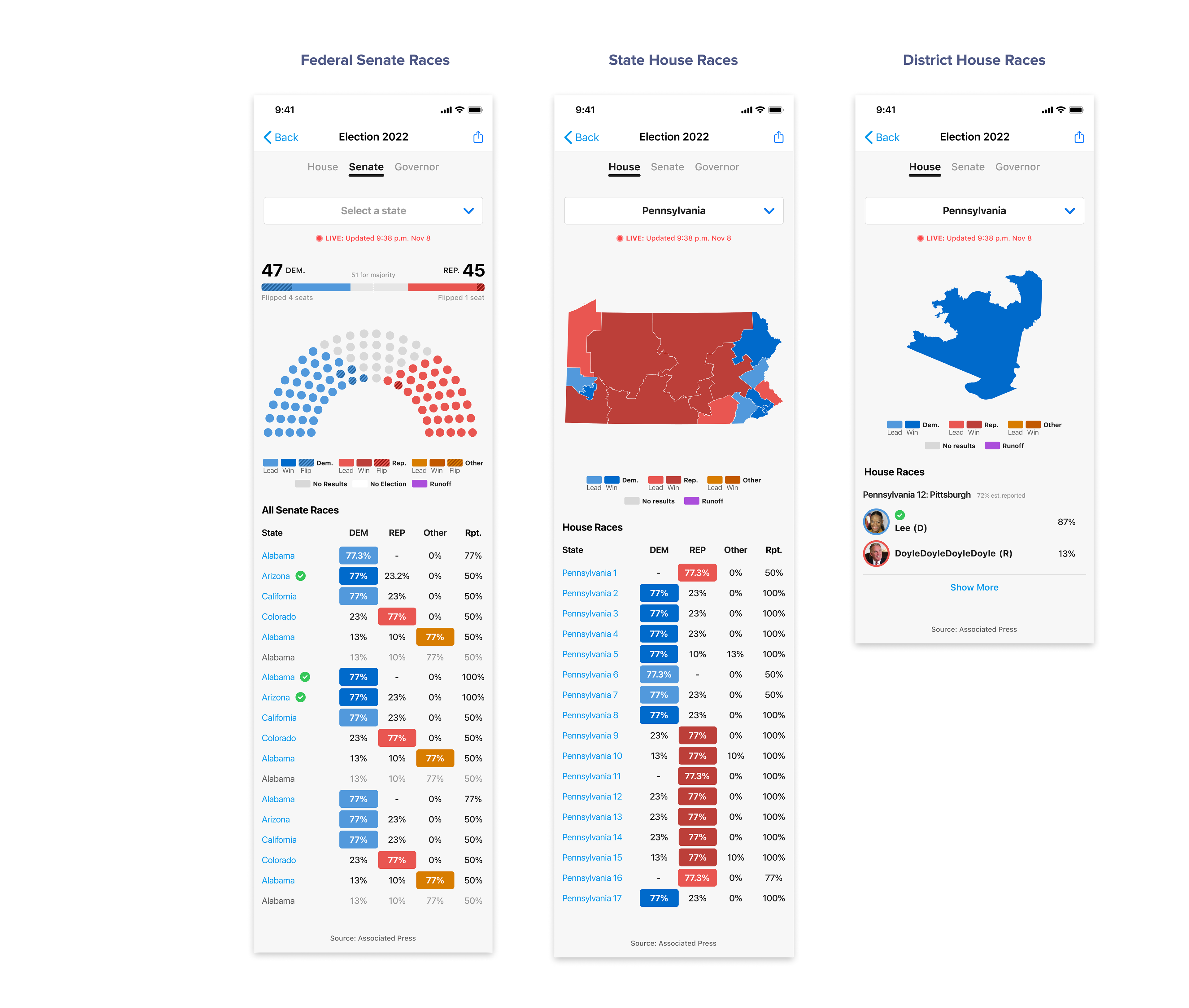
Federal
• Seating chart views for the Senate to show the balance of power and seats that have been won, flipped
• Seating chart views for the Senate to show the balance of power and seats that have been won, flipped
State
• Map view with district lines to see outcomes of House races
District
• For the House races, readers can click into their district by using the map view to see which candidate is leading or won in their district
ITERATE
(Feedback 🔄 Iteration) *6
After leadership and cross-functional teams reviewed the key design elements, I received much great feedback and opened up conversations with the team:
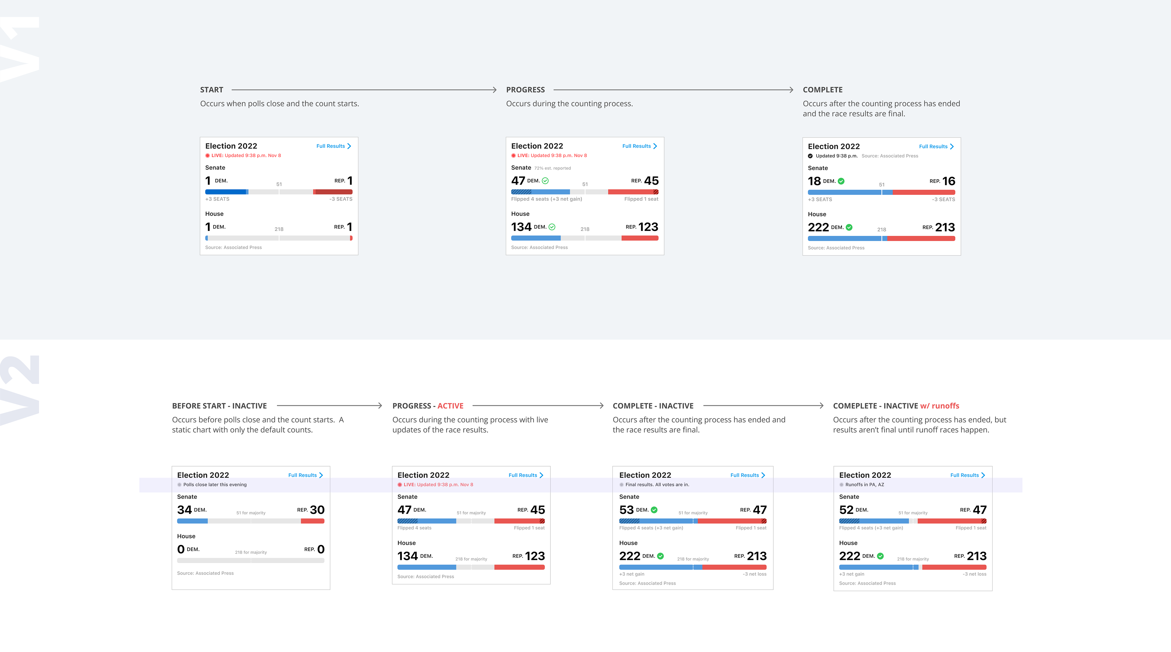
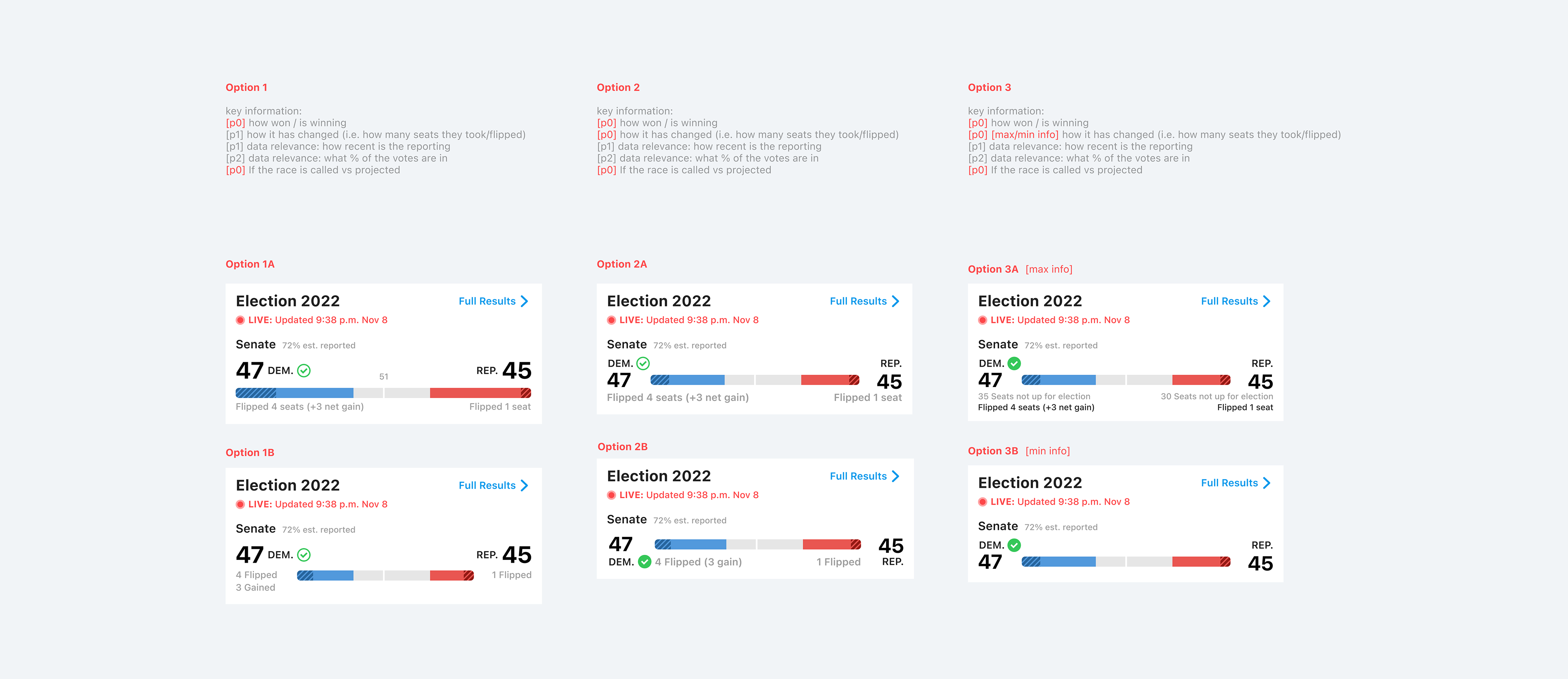
1. [DESIGN] Clarifying widget status for better readability
2. [ENGINEERING] Reuse more existing assets for developing efficiency
3. [BUSINESS] Reduce widget height for higher revenue
ITERATION 1 [DESIGN]
Clarify widget status
Problem
How can I present the widgets in more usability scenarios to reduce the readability fraction?
Solution
I synthesized the notes from internal group interview, and found the need not only to label the status of the widget as Active or Inactive, but also to broadcast the election status.
⇨ By knowing the election status, users can correspond with the numbers and bar charts on the widgets more easily
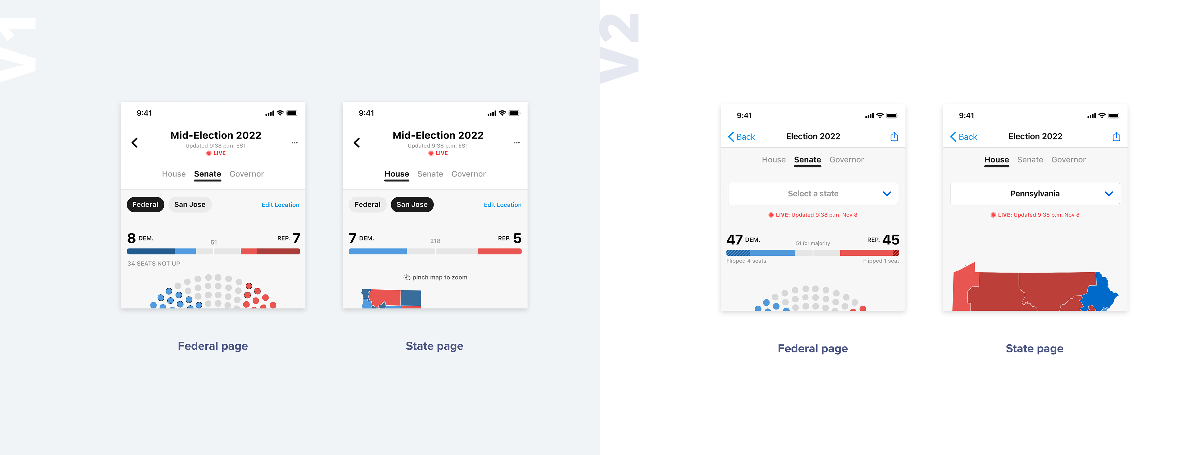
ITERATION 2 [ENGINEERING]
Problem
How can I help speed up the engineering development process without compromising design quality?
Solution
In the context of the engineering team being delayed, I took the initiative to help find a way to speed up the development process. I set up meetings with the frontend team and discovered using web components would have faster implementation than mobile components.
From design perspective, I used chips [mobile] initially because they flatten the page hierarchy.
I brainstormed another solution by using a dropdown [web] instead of chips [mobile] without complicating the navigation.
⇨ Clear hierarchy & increased development efficiency by 3 days
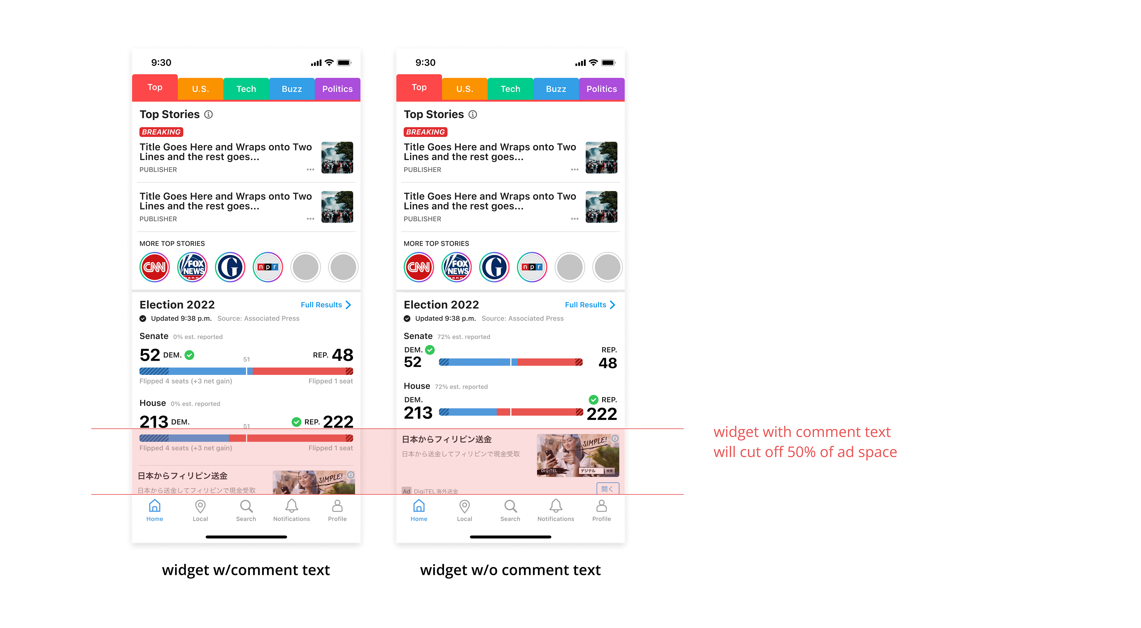
ITERATION 3 [BUSINESS]
Content v.s. Revenue
Problem
How can I advocate for user readability with business and content restrictions?
Context
Leadership elevated concerns from a business perspective that the election widget is oversized, which would impact ads revenue. However, from the Content team's perspective, having more information on the election widget can better broadcast the election.
Solution
Balance content & widget height by prioritizing key information. Also, partner with PM to calculate revenue differences in order to push for the best design decision.
⇨ Good readability + adequate information + low ads revenue loss
LAUNCH
November 8th
Finally, it's launch day!
The team gathered at the New York office to witness all our hard work being published and troubleshooting on the go. This is our final product:
RESULTS
Gratefully, this project was very successful and has exceeded 3x more of our goal metrics.
🌟 The widgets had an 18% CTR peak on the Election channel, which also brought 4x higher CTR on the Local channel.
🌟 Landing pages had a total of 2.2M page views overall.
🌟 The Election channel impacted +100sec of the app time spent.
LEARNINGS
Retrospective with the team
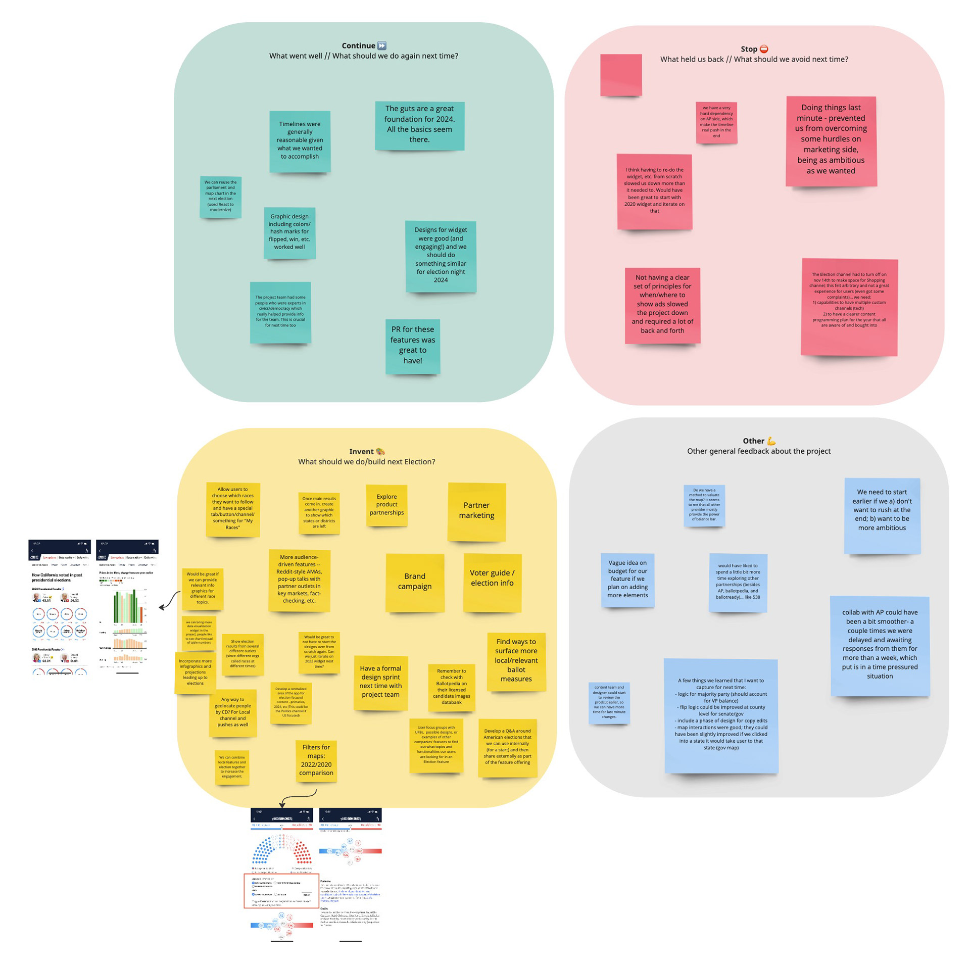
Of course, I worked with the best team that has all the great talents and passion. There were a lot of setbacks and limitations, but we still pulled it off!
I'm very lucky to have led the entire design with full support from cross-functional teammates.
🚀 Cheers!!